High Impact Vehicle Graphics
High Impact Vehicle Graphics today are all about instant recognition at speed, bold simplicity, and brand clarity.
Here’s how the best designs stand out on modern roads.
High Impact Vehicle Graphics Design Principles That Actually Work
You have 3–5 seconds of attention. Design for that.
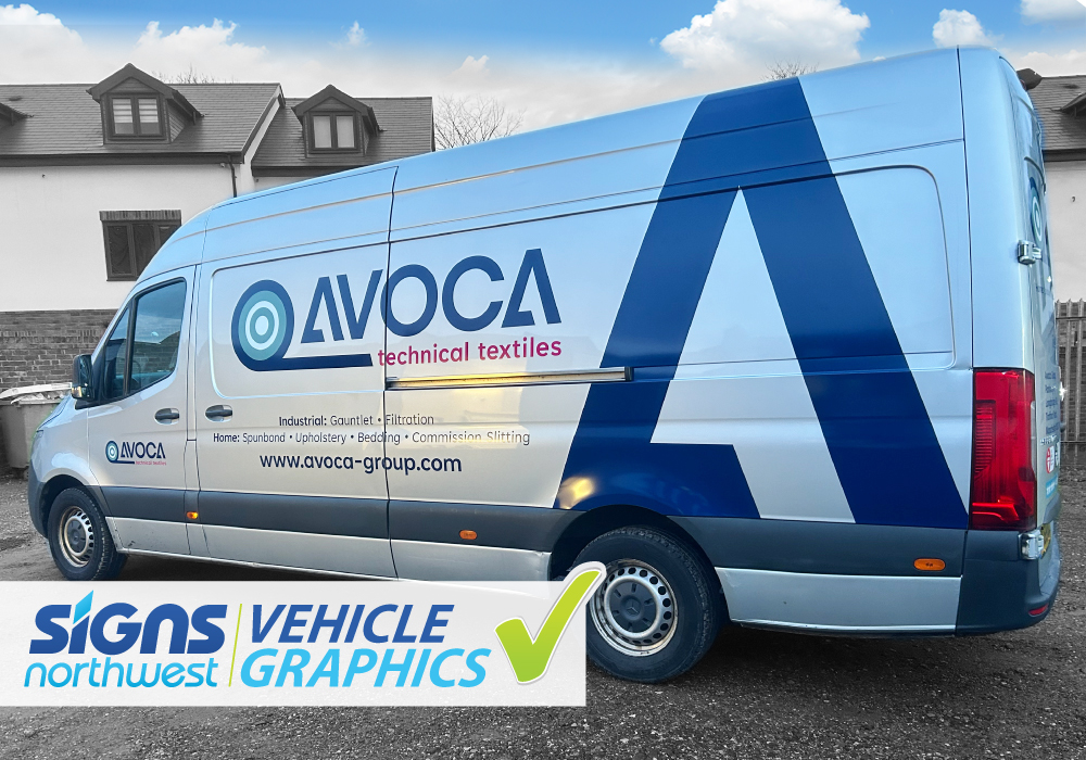
- One core message only (brand name OR service, not everything)
- Large typography (readable from 30–50 meters)
- High contrast colors (dark/light, not mid-tones)
- Minimal copy (phone, URL, or slogan—pick one)
If it can’t be read at 60 km/h, it’s decoration, not communication.
Current High Impact Vehicle Graphics Trends
Bold & Modern
- Oversized logos spanning panels and doors
- Cropped typography that bleeds off edges
- Flat colors with zero gradients
Ultra-Minimal
- White or black vans with one accent color
- Simple icon + brand name
- Feels premium and confident
Dynamic Motion
- Diagonal lines or shapes suggesting speed
- Forward-leaning typography
- Great for delivery, tech, trades
Smart Negative Space
- Using door gaps, handles, and panels intentionally
- Graphics that “break” across body lines
- Makes the van feel designed, not wrapped